UI / UX Design
Email Marketing Analytics - Turning Campaign Data into Capital Raising Intelligence
Private token issuers were running email campaigns with no way to isolate whether underperformance was a content problem, an infrastructure problem, or an audience problem. This tool was built to answer that question precisely.
Year :
2025
Industry :
Fintech
Company
Compliance Innovation
Project Duration :
3 Months

OverView
The platform gives asset owners the tools to tokenise real-world assets, raise private capital, and manage investor relationships on a regulated blockchain infrastructure. Email marketing shipped early because issuers needed direct investor communication immediately. Analytics was sequenced for later.
That sequencing had a consequence. Issuer interviews revealed a pattern: campaigns were underperforming expectations, and confidence in the platform was quietly eroding. Not explicit complaints but something more damaging. Issuers couldn't distinguish between a content problem, a deliverability problem, and an audience problem. Every failed campaign had nowhere to land except on the platform itself.
The brief: Build an analytics system that separates template effectiveness, sender deliverability, and audience quality. Independently, precisely, and in a language a non-marketer can act on.
Outcome
Designed and shipped an email marketing analytics dashboard giving private token issuers complete visibility into campaign performance for the first time.
For the first time, issuers could diagnose campaign underperformance without raising a support query. Template effectiveness, sender deliverability, and audience quality each scored independently, each pointing to a precise corrective action.
My Role
Led the solution end to end from identifying the problem gap through user research, to defining the analytical framework, to high-fidelity design and engineering collaboration through shipment.
Problem
No analytics meant no direction. Issuers were spending on outreach with no way to improve it.
Issuers had no way to know whether a campaign underperformed because of the template, the sender domain, or the contact list. Every diagnosis was a guess and every corrective action was blind.
With no performance feedback after each campaign, issuers repeated the same templates, same sender IDs, and same audience groups across campaigns. Outreach budget was spent with no signal to improve against.
When campaigns fell short, there was no data to explain why. Confidence in the platform eroded quietly, not through explicit complaints, but through a growing sense that the tool wasn't working for them.
Solution
Iteration 1 - The campaign view


The first direction was a unified campaign table, every campaign, all metrics, one view. Clean, structured, and the most logical starting point.
But it answered the wrong question. What happened? not why, and what should change.
For example, an issuer looking at "Launch_Asset_02" with 6.8% open rate and 4.1% unique clicks has numbers but no diagnosis. Was it the template, the sender domain, or the audience? The table cannot answer, it conflates all three variables into one row. And with no synthesising signal, the issuer has to process 8 columns across all campaigns to form a conclusion. Nielsen Norman Group's research on information overload is direct: beyond 7±2 data points, users stop analysing and start guessing.
The question it forced: Is the campaign the right unit of analysis for a diagnostic tool, or just the most obvious one?
The answer: The campaign is the outcome. Template, sender and audience are the variables. Diagnosing an outcome without isolating its variables is not analytics. It's reporting.
Iteration 2 - Three variables, three sections


The campaign as unit of analysis was replaced with the variable as unit of analysis. Three independent sections: template effectiveness, sender deliverability and audience quality, each measured on their own terms, each answering a distinct diagnostic question.
This solved the attribution problem iteration 1 couldn't. An issuer could now look at their template data independently of their sender data. A underperforming campaign had three specific places to investigate rather than one conflated view.
But a new problem surfaced immediately. Each section presented the right data: open rate, CTR, bounce rate, unsubscribe rate but offered no hierarchy between rows. An issuer looking at four templates across eight metric columns had the right information but no clear entry point. Which template do I look at first? Which sender is the problem? The data was separated correctly. It still wasn't actionable without a reference point.
The question it forced: correct attribution is necessary but not sufficient. How does a non-expert user know what good looks like across any of these metrics, in this sector, for this audience type, at this send volume?
Iteration 3 - Introducing the scoring system (Final)
Reviewing the three-variable design internally, the gap was clear. The right data was visible but comparing performance across rows required mentally processing every metric column simultaneously. Which template is working better than others wasn't answerable at a glance and for an issuer who needs to know what resonates with their investor audience before launching their next campaign, that comparison is the entire point.
We validated with users and behaviour confirmed it. Issuers could read the data but couldn't rank it.
The decision: Each section needed a synthesised performance signal. One column that made cross-row comparison instant.

But a score is only meaningful if what goes into it is honest. A generic formula applied equally across template, sender and audience would produce numbers not insight. Each dimension controls different variables, operates under different constraints, and fails in different ways. The scoring had to reflect that.
Template score excludes open rate because the template doesn't write the subject line. Sender Trust Score weights delivery rate highest because infrastructure failure is binary. If emails don't arrive, nothing else matters. Audience Health Score weights engagement decay and bounce rate heavily as a disengaging, unreachable investor list is a capital-raising liability, not just a metric.
Three behavioural principles that grounded every decision
Hick's Law - More choices slow decisions. The score reduces the primary question: Is this working? to a single signal. The issuer acts on the score first, investigates the detail only when needed.
Attribution bias - People blame external causes when internal data is absent. Separating template, sender and audience performance into visible, independent scores gave every underperforming campaign a specific internal cause to investigate.
Feedback loop - Behaviour only changes when feedback is immediate and specific. The three-section architecture gave issuers what the campaign view never could, an immediate feedback per variable after every send, specific enough to act on without interpretation.
More Projects

UI / UX Design
Regulated Pre-IPO Exchange Platform - 30% Faster Trade Execution, 3x Higher Closure Rate
Rebuilding the UX architecture and trade flow system for a pre-IPO share exchange platform, from a broken, document-heavy process to a structured, automated sequence that closes more deals, faster.
UI / UX Design
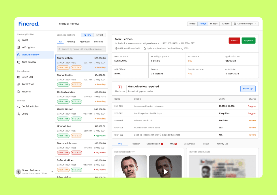
Loan Review Dashboard - designing the compliance workspace for consumer lending platforms
A compliance review dashboard consolidating identity, credit, fraud, and AML signals into one structured workspace that is designed for loan officers at regulated fintech lending platforms.
UI / UX Design
Email Marketing Analytics - Turning Campaign Data into Capital Raising Intelligence
Private token issuers were running email campaigns with no way to isolate whether underperformance was a content problem, an infrastructure problem, or an audience problem. This tool was built to answer that question precisely.
Year :
2025
Industry :
Fintech
Company
Compliance Innovation
Project Duration :
3 Months
OverView
The platform gives asset owners the tools to tokenise real-world assets, raise private capital, and manage investor relationships on a regulated blockchain infrastructure. Email marketing shipped early because issuers needed direct investor communication immediately. Analytics was sequenced for later.
That sequencing had a consequence. Issuer interviews revealed a pattern: campaigns were underperforming expectations, and confidence in the platform was quietly eroding. Not explicit complaints but something more damaging. Issuers couldn't distinguish between a content problem, a deliverability problem, and an audience problem. Every failed campaign had nowhere to land except on the platform itself.
The brief: Build an analytics system that separates template effectiveness, sender deliverability, and audience quality. Independently, precisely, and in a language a non-marketer can act on.
Outcome
Designed and shipped an email marketing analytics dashboard giving private token issuers complete visibility into campaign performance for the first time.
For the first time, issuers could diagnose campaign underperformance without raising a support query. Template effectiveness, sender deliverability, and audience quality each scored independently, each pointing to a precise corrective action.
My Role
Led the solution end to end from identifying the problem gap through user research, to defining the analytical framework, to high-fidelity design and engineering collaboration through shipment.
Problem
No analytics meant no direction. Issuers were spending on outreach with no way to improve it.
Issuers had no way to know whether a campaign underperformed because of the template, the sender domain, or the contact list. Every diagnosis was a guess and every corrective action was blind.
With no performance feedback after each campaign, issuers repeated the same templates, same sender IDs, and same audience groups across campaigns. Outreach budget was spent with no signal to improve against.
When campaigns fell short, there was no data to explain why. Confidence in the platform eroded quietly, not through explicit complaints, but through a growing sense that the tool wasn't working for them.
Solution
Iteration 1 - The campaign view
The first direction was a unified campaign table, every campaign, all metrics, one view. Clean, structured, and the most logical starting point.
But it answered the wrong question. What happened? not why, and what should change.
For example, an issuer looking at "Launch_Asset_02" with 6.8% open rate and 4.1% unique clicks has numbers but no diagnosis. Was it the template, the sender domain, or the audience? The table cannot answer, it conflates all three variables into one row. And with no synthesising signal, the issuer has to process 8 columns across all campaigns to form a conclusion. Nielsen Norman Group's research on information overload is direct: beyond 7±2 data points, users stop analysing and start guessing.
The question it forced: Is the campaign the right unit of analysis for a diagnostic tool, or just the most obvious one?
The answer: The campaign is the outcome. Template, sender and audience are the variables. Diagnosing an outcome without isolating its variables is not analytics. It's reporting.
Iteration 2 - Three variables, three sections
The campaign as unit of analysis was replaced with the variable as unit of analysis. Three independent sections: template effectiveness, sender deliverability and audience quality, each measured on their own terms, each answering a distinct diagnostic question.
This solved the attribution problem iteration 1 couldn't. An issuer could now look at their template data independently of their sender data. A underperforming campaign had three specific places to investigate rather than one conflated view.
But a new problem surfaced immediately. Each section presented the right data: open rate, CTR, bounce rate, unsubscribe rate but offered no hierarchy between rows. An issuer looking at four templates across eight metric columns had the right information but no clear entry point. Which template do I look at first? Which sender is the problem? The data was separated correctly. It still wasn't actionable without a reference point.
The question it forced: correct attribution is necessary but not sufficient. How does a non-expert user know what good looks like across any of these metrics, in this sector, for this audience type, at this send volume?
Iteration 3 - Introducing the scoring system (Final)
Reviewing the three-variable design internally, the gap was clear. The right data was visible but comparing performance across rows required mentally processing every metric column simultaneously. Which template is working better than others wasn't answerable at a glance and for an issuer who needs to know what resonates with their investor audience before launching their next campaign, that comparison is the entire point.
We validated with users and behaviour confirmed it. Issuers could read the data but couldn't rank it.
The decision: Each section needed a synthesised performance signal. One column that made cross-row comparison instant.
But a score is only meaningful if what goes into it is honest. A generic formula applied equally across template, sender and audience would produce numbers not insight. Each dimension controls different variables, operates under different constraints, and fails in different ways. The scoring had to reflect that.
Template score excludes open rate because the template doesn't write the subject line. Sender Trust Score weights delivery rate highest because infrastructure failure is binary. If emails don't arrive, nothing else matters. Audience Health Score weights engagement decay and bounce rate heavily as a disengaging, unreachable investor list is a capital-raising liability, not just a metric.
Three behavioural principles that grounded every decision
Hick's Law - More choices slow decisions. The score reduces the primary question: Is this working? to a single signal. The issuer acts on the score first, investigates the detail only when needed.
Attribution bias - People blame external causes when internal data is absent. Separating template, sender and audience performance into visible, independent scores gave every underperforming campaign a specific internal cause to investigate.
Feedback loop - Behaviour only changes when feedback is immediate and specific. The three-section architecture gave issuers what the campaign view never could, an immediate feedback per variable after every send, specific enough to act on without interpretation.
More Projects
UI / UX Design
Regulated Pre-IPO Exchange Platform - 30% Faster Trade Execution, 3x Higher Closure Rate
Rebuilding the UX architecture and trade flow system for a pre-IPO share exchange platform, from a broken, document-heavy process to a structured, automated sequence that closes more deals, faster.
UI / UX Design
Loan Review Dashboard - designing the compliance workspace for consumer lending platforms
A compliance review dashboard consolidating identity, credit, fraud, and AML signals into one structured workspace that is designed for loan officers at regulated fintech lending platforms.