UI / UX Design
FINRA Regulated Pre-IPO Exchange Platform - 30% Faster Trade Execution, 3x Higher Closure Rate
Rebuilding the UX architecture and trade flow system for a pre-IPO share exchange platform, from a broken, document-heavy process to a structured, automated sequence that closes more deals, faster.
Year :
2024-2025
Industry :
Fintech
Company
Compliance Innovation
Project Duration :
1 Year
OverView
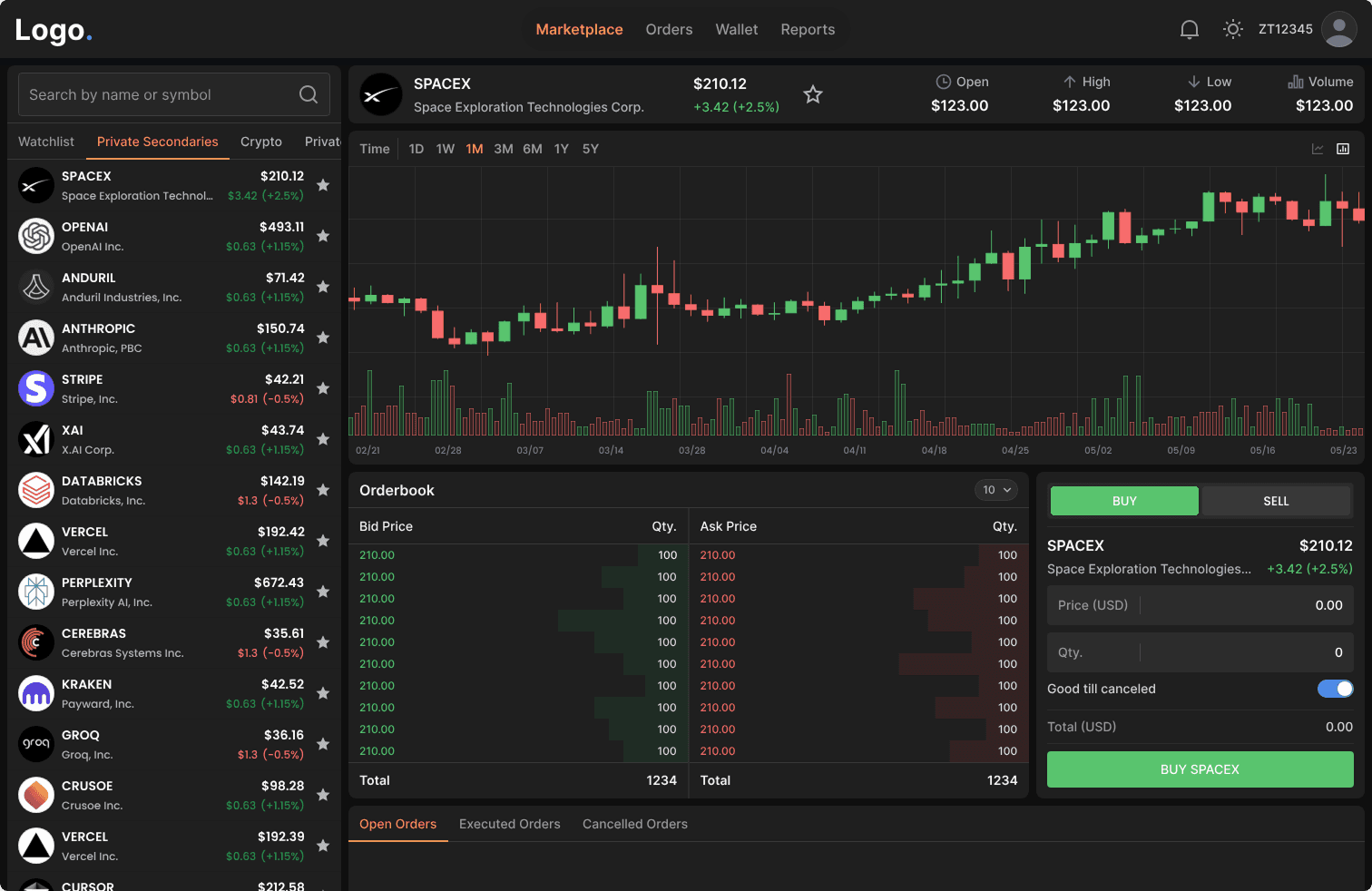
Pre-IPO secondary markets let employees and early investors sell private company shares before a company goes public and let accredited investors buy in before an IPO valuation reset.
The platform supports many deal structures to execute pre-ipo investments. Each structure has a different step count, different legal instruments, different signing sequences, and a different experience for buyer and seller. This case study focuses on the Direct + Forward Contract flow the complex and highest-volume structure on the platform.
Here's how it works: Every transaction moves through a regulated sequence: identity verification, legal document signing, a company's 30-day Right of First Refusal window, FBO escrow payment, and formal share assignment. When a company blocks a direct transfer, the deal restructures automatically into a Forward Contract-a separate legal instrument with its own negotiation flow, signing sequence, and deferred settlement tied to a future exit event.
The platform was built to automate all of this but the original design handled none of it. It failed to gain user’s trust due to no visibility into where their trade stood, no clarity on what to do next, and no confidence that their money was safe. Trades were abandoned mid-flow. Deals were lost.
30% Faster trade execution
60 days average → 42 days
3× Higher trade closure rate
15 in 100 trades → 45 in 100
$450K Additional deal value unlocked
Per every 100 trades on the platform
35% reduction
in support tickets
My Role
Led the design from first principles to final handoff. Prototyping, user testing, developer collaboration and design system documentation.
Problem and Solution
User Problem - (High-Stakes Investing Felt Like Navigating Blindfolded)
Pre-IPO equity is highly sought after among accredited investors, but access remains difficult. While platforms like Forge Global and EquityZen have made private-market investing more accessible, parts of the process still rely on email, paperwork, and intermediary coordination, and the level of visibility into deal progress varies by platform. There is no real-time dashboard to track where a trade stands.
What they need is not just a faster process. They need a customised dashboard that puts them in control, one that tells them exactly where their trade stands, what requires their attention, and what comes next at every step. A system that makes a complex, multi-week legal process feel transparent, predictable, and safe.

Current Product Problems
Client's platform attempted to solve this with a customized order dashboard, giving users visibility into each step to build a sense of control. The intent was right. The execution failed. A UX audit, combined with user interviews, internal analytics and tracking tools told a different story. The data pointed to two categories of failure.
Low Trade Closure Rate
Only 15 in every 100 trades were closing.
Long Trade Execution Time
Support tickets were high and clustered around the same steps repeatedly. Execution was averaging 60 days.
Business Problem
Bad UX in fintech is a revenue problem, not a design problem. With a 2.5% fee per side on $25,000 minimum transactions, every abandoned trade is $1,250 in direct platform revenue gone. At a 15% closure rate across hundreds of monthly transactions, the loss wasn't marginal, it was structural.
The deeper cost was credibility. The old design made the platform handling institutional-sized stakes look like an unstable MVP. First-time users comparing it to Forge Global or EquityZen made that judgment in 30 seconds. A platform cannot charge institutional fees while looking like a prototype. The redesign had one mandate: close more trades, faster, by making every user feel confident enough to keep going.
Solution and Iterations
Category 1 : Low Trade Closure Rate
The platform attempted to solve this with a customized order dashboard, giving users visibility into each step to build a sense of control. The intent was right. The execution failed. A UX audit, combined with user interviews and drop-off analysis, revealed seven structural failures.
1) Order placement was a modal
The buy and sell order forms lived inside a 768px overlay modal. Modals are designed for confirmations and interruptions, not for initiating a legally binding financial commitment. Users told us that they hesitated before even filling the form, "it didn't feel serious enough." The primary CTA said "Continue" with no indication of how many steps followed.
Before
After
Before
After
Before
After
What we changed:
Order placement became a dedicated multi-step page with a clear step indicator showing exactly where the user was across all steps. No close button. No escape. Spatial permanence that matched the weight of the action.
2) The tracker was the workspace
The progress stepper was the entire screen. A single non-collapsible column where navigation, status, and primary actions all lived inside the same component with no structural separation.
The information architecture was fundamentally broken. Every step, completed, active, pending were rendered at full height, forcing users to scroll through resolved history just to locate their current action. There was no spatial hierarchy between what was done and what needed a decision. Users couldn't scan the screen. They couldn't orient themselves. And they couldn't confidently act because nothing on the screen told them what mattered right now.
Before
After
Before
After
Before
After
What we changed:
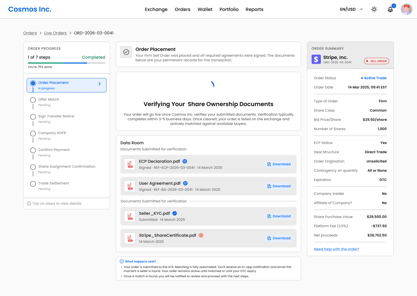
We introduced a strict 3-column layout with non-overlapping ownership:
Left column: Tracker only. Progress navigation, step states, timestamps. Never contains a button, an input, or a document. Its only job is to show where the user is in the flow.
Middle column: Workspace. Every actionable moment like document signing, price negotiation, payment confirmation gets a dedicated full-width screen with its own hierarchy and context.
Right column: Dynamic order summary. The original order details, always visible, updates as trade progress. A financial anchor throughout the entire transaction.
3) Steps carried only system information
The stepper reflected system status, not user confidence. It showed operational updates but offered no clarity on what the current step actually meant, or what would happen next. The Offer Match step was a clear example, in the old design it was a single line with a label and a timestamp. No way to know if the platform was actively working or if something had stalled. Users with live orders had no reason to stay engaged and many didn't.
What we changed:
Every step across the entire flow suffered from the same problem - steps only told users what the system had done, never what it meant or what came next, with no context. The Offer Match screen is a clear example of how we addressed this:
An animated searching icon communicating active platform activity like something is happening, not stuck.
Contextual time expectation: "Matching typically takes 1–7 days depending on available sellers at your bid price", calibrating the user before anxiety sets in.
A link to view other active listings at similar price points, giving users something useful to do while they wait.
A "What happens next" section on every step screen explaining exactly what the platform is doing, what the counterparty is doing, and what the user will be asked to do when their turn comes.
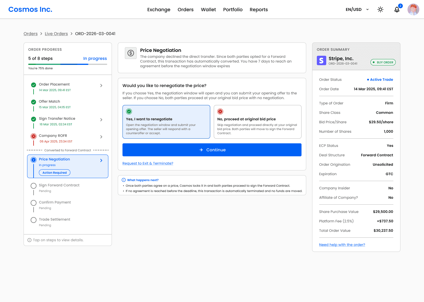
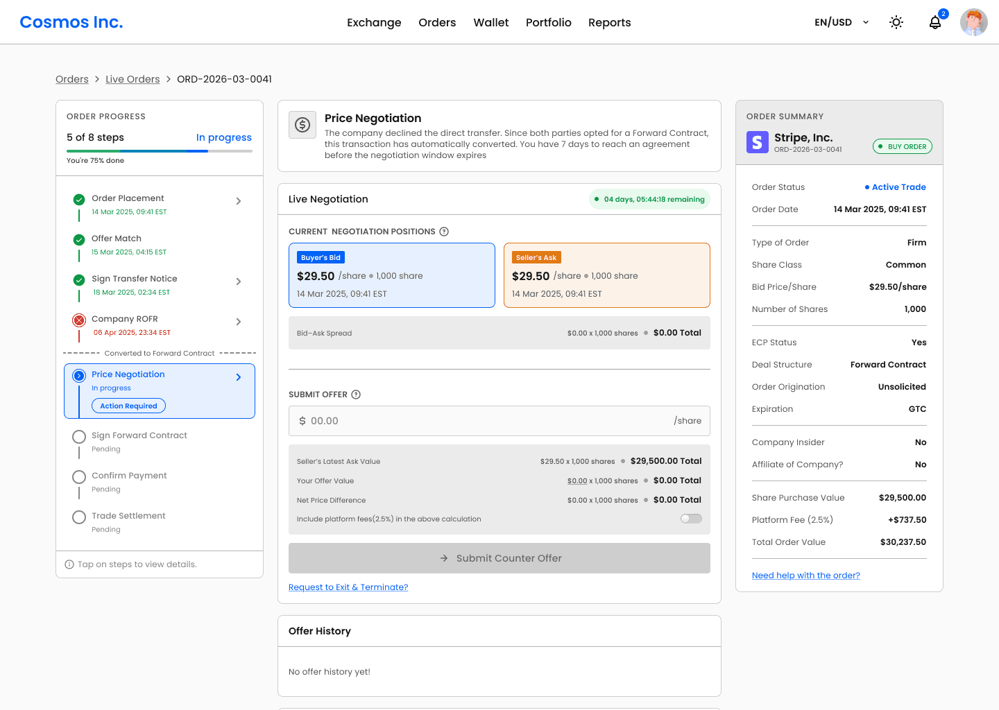
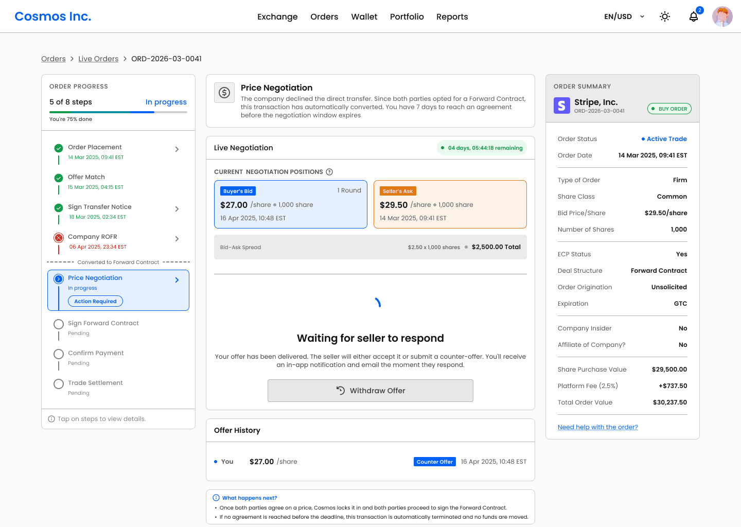
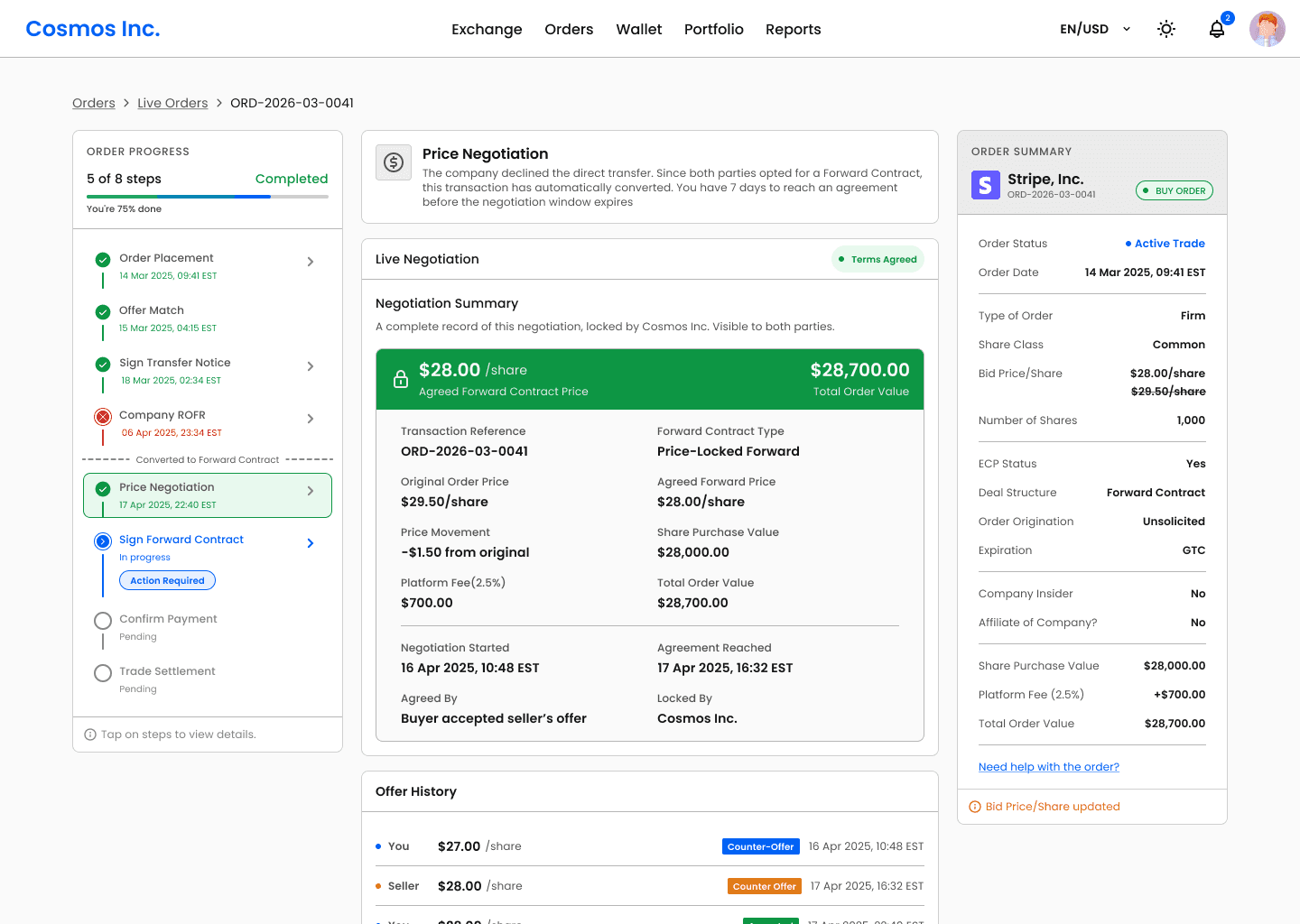
4) The negotiation screens were structurally broken
Accept and Reject were two equally sized adjacent buttons inside a 356px tracker column with no confirmation layer. A user could accept or reject a multi-thousand dollar counter-offer with a single tap, with no summary of what they were agreeing to? The offer history was not visible. The net proceeds impact of different price points was never shown. Users were making irreversible financial decisions with less friction than deleting a photo.
What we changed:
Negotiation became a dedicated full-width screen built around informed decision-making:
Full offer history timeline: every bid and counter shown in sequence with timestamps, so both parties have complete context before acting
Live net proceeds preview: As either party adjusts their offer, the net proceeds update in real time. "At $29.50: your net proceeds = $29,250.00", the financial consequence of every price point is visible before commitment.
5) The ROFR waiting window generated the most support tickets
The 30-day company ROFR period, where a company reviews and approves or declines the share transfer was the single highest-traffic source of support requests. The old design showed "Wait for company ROFR" with no explanation of what the window was, how long it would last, what the possible outcomes were, or what would happen next. Users in a 30-day waiting window with no context assumed the worst. They emailed support.
What we changed:
The ROFR step became one of the most information-rich screens in the flow:
Three distinct outcome states designed: Approved, Declined, and No Response (30-day), each with its own screen, explanation, and "What happens next" section.
Plain language explanation of ROFR: what it is, why it exists, and what the company is legally allowed to do, written for a first-time user, not a lawyer.
Time calibration copy: "Most companies respond within 7–14 days", so users know what a normal wait looks like before they start worrying.
6) Copywriting was transactional, not guiding
Every step label was a status tag. For example at the payment step, the old design showed "Order payment from buyer" with a status of Complete and nothing else. No breakdown of what was paid or what the platform had done with the funds or what came next. A transaction worth $30,000 closed with less ceremony than a read receipt.
In a process most users are navigating for the first time, copy is the only guide they have. It read like a backend log, not what the user needed to understand. And this wasn't isolated to one step, every screen across the flow had the same problem.
What we changed:
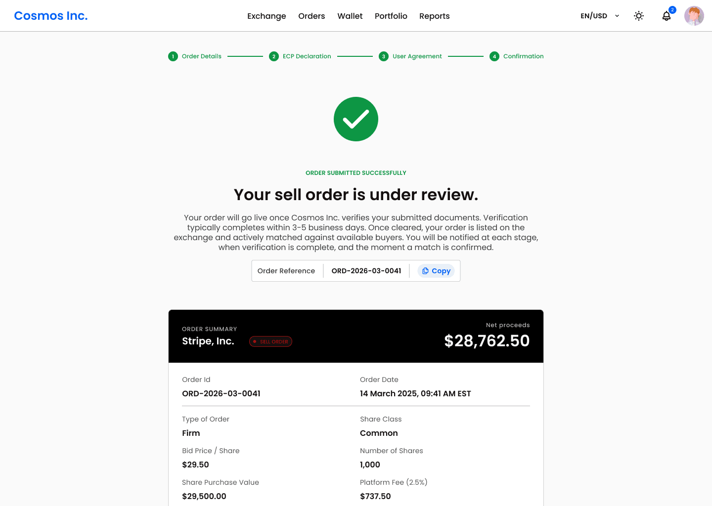
Every step was rewritten around one rule: each screen must tell the user what is happening now, what their job is, what the counterparty is doing, and what comes next. Applied across the entire flow, for example on the payment and settlement screens:
Full fee and proceeds breakdown before and after payment confirmation.
When payment is confirmed, the buyer receives explicit confirmation that their funds have moved into a regulated FBO escrow account held at the platform's partner bank along with other details.
A settlement screen showing every action the platform took: fee deducted, proceeds released, documents issued, trade recorded.
Category 2 : Long Trade Execution Time
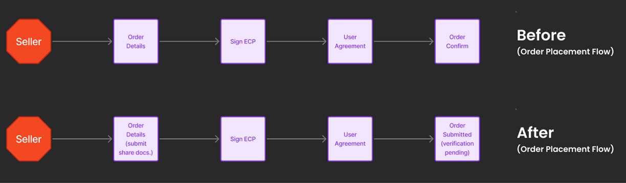
1) Removing Due Diligence in Flow - A Foundational Decision
The Problem:
Step 3 was Due Diligence, a manual step placing the entire responsibility of verifying share ownership on the buyer. After a match, buyers had to manually request identity documents and share certificates from an anonymous seller, wait for responses with no timeline, and independently cross-reference ownership records against cap table data they had no access to.
For a first-time participant in a private secondary market, this was not a due diligence step. It was an investigation. The timeline spoke for itself:
2 to 4 days for document collection, depending on how quickly each side responded
7 to 10 days for the buyer to independently verify ownership
A single step consuming 9 to 14 days of every trade
What We Explored First And Why We Rejected It:
Before making the decision to remove Due Diligence from the flow entirely, we designed it. Both buyer and seller states, the document request flow, verification status screens, fully built.
But user interviews told us something the screens couldn't fix. Users weren't dropping off just because of the poorly designed Due Diligence screens. They were dropping off because buyers reaching this step had no idea what share verification actually required of them. They were expected to independently cross-reference share certificates against cap table records and company filings they had no direct access to.
The Decision and Solution:
We made the harder call. The screens were discarded. The step was removed. Removing this step was not a design decision alone. It required buy-in from top management because it meant fundamentally changing how trades were processed on the platform. The platform had always placed verification responsibility on the buyer. Shifting it to the platform meant owning the process, building the infrastructure to support it, and taking on the operational cost of verifying every seller before they go live. It was a tough call. But the data made it impossible to ignore, the highest drop-off step in the flow, consuming up to 14 days per trade, was a direct result of this model. The decision was made.
Rather than making changes inside the existing order flow, we moved verification entirely to the order placement stage. At order placement, the seller is asked to do two things:
Upload their share ownership documents once
Tick a consent checkbox to share their KYC details already held by the platform from onboarding - no resubmission, no forms
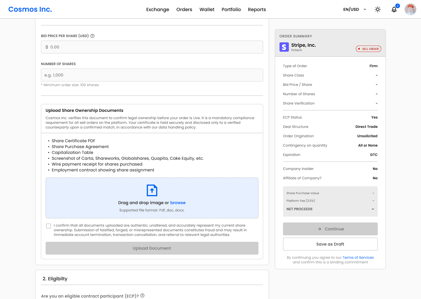
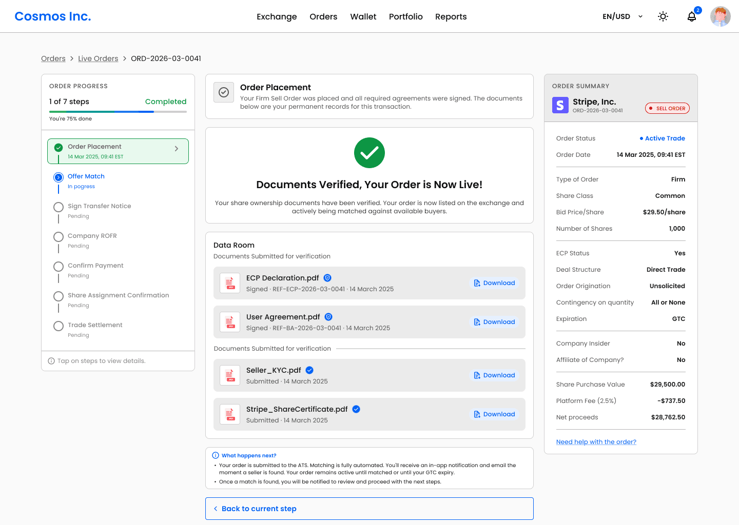
The order does not go live until the platform completes verification. We built an internal verification system designed to be reused consistently across every transaction. Once verified, the order goes live and is actively matched. Every buyer on the platform now matches exclusively against pre-verified sellers.
The Impact :
Reduced verification time from 9 to 14 days down to 3 to 5 business days
Eliminated the single highest drop-off step in the entire flow
Buyers match against verified inventory only
Simplified the seller experience to one upload and one checkbox at order placement
Freed both parties from a manual back-and-forth that had no place in an automated transaction platform
2) ROFR and Negotiation - The Case Against Parallel Processing
The Problem:
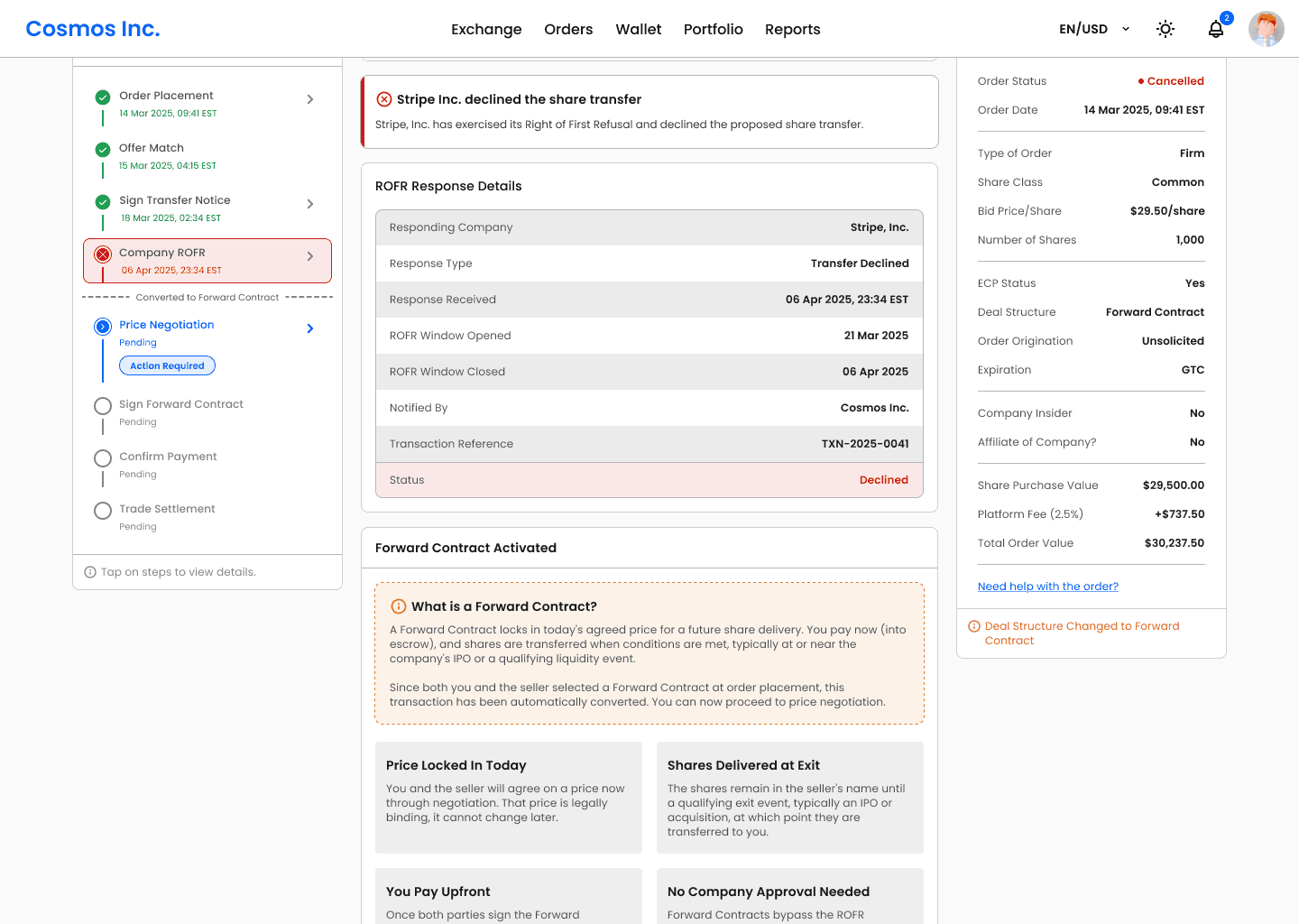
In the Direct + Forward Contract flow, when a company declines a direct share transfer, the deal automatically converts to a Forward Contract, a separate legal agreement where the buyer still acquires the shares, but receives them at a future exit event such as an IPO or acquisition rather than immediately. Before this conversion can be finalised, both parties need to agree on the Forward Contract price through a negotiation window.
When we mapped the full transaction timeline, the price negotiation window stood out immediately. The price negotiation window had no deadline. It stayed open until both parties agreed or stopped responding entirely. Analytics showed this averaging 7 days per trade, with no upper limit. We could eliminate/reduce time on this step.
What We Explored First And Why We Rejected It:
The company's review period lasts up to 30 days. Since the company's right applies only to the direct transfer and not to the Forward Contract price, there was a theoretical opportunity to open negotiation in parallel while the review was still running.
If both parties pre-agreed a Forward Contract price during the wait, the deal could activate the moment the review closed, potentially saving the entire negotiation window. We explored this seriously. Then rejected it for two reasons.
UX cost: Running two concurrent processes breaks the foundational principle, users cannot hold two simultaneous mental states. More importantly, a user negotiating a price for a deal that might never happen is not motivated to negotiate seriously. Offer quality drops, rounds increase, and user confidence drops.
Engineering cost: The company's review and the Forward Contract negotiation are two legally distinct processes running on the same transaction record. If the company approves the transfer mid-negotiation, every negotiation state has to be discarded instantly and cleanly. The conflict resolution logic is complex, the edge cases multiply, and the engineering debt is significant all for a time saving that is not guaranteed.
The Solution:
Instead of opening negotiation earlier, we made the existing window work harder. We introduced a 5-day countdown timer on the negotiation window, replacing an open-ended process with a defined, visible deadline. Certainty replaced ambiguity. Both parties now know exactly how long they have, which changes the psychology of negotiation entirely. Offers become more serious. Rounds decrease. Decisions get made.
The Impact:
Replaced an undefined negotiation window with a fixed 5-day deadline, introducing urgency where none previously existed.
Reduced average negotiation duration from an open-ended 7-plus days to a structured 5-day window.
3) Payment failure surfaced too late in the flow
The Problem:
Buyers were making it through all stages, only to stall at payment because their wallet balance was insufficient. By that point both parties had invested 30+ days of effort. A funding gap that could have been flagged on day one was only visible on day thirty. Deals that were days from completion were collapsing entirely.
The Solution:
The fix required no changes to the transaction flow itself. At order placement, when the buyer enters their bid price and share quantity, the platform now runs a soft wallet sufficiency check against their current balance. Two outcomes:
Sufficient balance - order placement continues with no friction added
Insufficient balance - an amber inline warning appears: "Your current wallet balance will not cover this order at payment. Consider topping up before your trade reaches the payment step."
The warning is non-blocking. The buyer can still place the order. The decision to act on it is theirs. This was a deliberate choice, a hard block at order placement would turn away motivated buyers who intend to fund their wallet before payment arrives. A soft warning surfaces the gap 30 days earlier without reducing order volume.
Intentional Design Decisions
Small decisions, deliberate reasoning. Every detail on these screens was designed to reduce anxiety, build trust, and keep users moving, not just to look good.
1) First-time transaction onboarding overlay
On a user's first transaction, a one-time modal overlay shows a guided tour of the entire flow, step by step, with role tags, time estimates, and plain-language descriptions of what happens at each stage. Users who know the shape of the journey before it starts are far less anxious during it. The principle: reduce the fear of the unknown, not just the steps themselves.
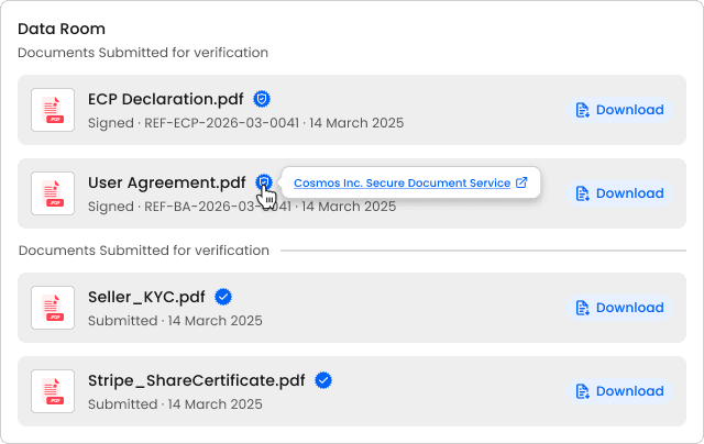
2) Document trust signals
Every signed document now displays a tamper-evident timestamp - "Signed · DD/MM/YYYY, HH:MM EST” with a security badge, making signatures feel permanent and legally real rather than a checkbox on a PDF. A similar badge also appears for documents/user verified by the platform, "Verified by Cosmos Inc."
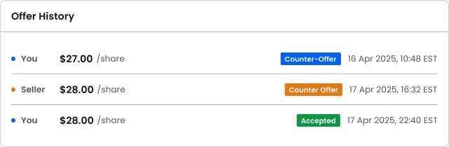
3) Negotiation history as a transparent timeline
The negotiation screen now shows the full offer history as a scrollable timestamped timeline, every bid and counter, in sequence, visible to both parties.
4) Live net proceeds preview during negotiation
As either party adjusts their offer, the column below offer input box updates in real time. "At $29.50: your net proceeds = $29,250.00." A toggle lets users include or exclude the platform fee from the displayed offer value, keeping the calculation transparent without making it cognitively overwhelming.
5) ROFR countdown reframed as a milestone, not a wait
The ROFR countdown is reframed from an anxious timer into a progress milestone. "The 30-day window closes DD/MM/YYYY. Once it closes, your Forward Contract automatically activates." The clock closing becomes a good event, the thing that unlocks the next step.
6) Explicit progress quantification at every step
The existing progress bar is made explicit, e.g "6 of 8 steps complete · 75% done". Behavioural economics identifies this as the endowment effect on progress: once a user has invested 50% of a journey, abandoning it registers as a loss, not a neutral exit.
7) Toaster notifications with progress bar and action links
Every system notification now includes a 2px depleting progress bar Toaster notification, green for success, blue for informational, amber for pending. Critically, each toaster includes the next logical action as a clickable inline link.
8) Abandoned transaction recovery, persistent in-app prompt
If a required action goes untaken for 24 hours, a persistent in-app banner surfaces. The fintech equivalent of cart abandonment recovery.
Shipping to design system
Since this was a newly introduced pattern, I documented all states, variants, interactions, and edge cases in full and handed it off to the design system.
In summary, I closed more trades, faster, by
01.
01.
Removing days from execution time
Eliminated the highest drop-off step entirely by moving verification upstream, capped the negotiation window at 5 days, and surfaced wallet shortfalls at order placement, cutting average execution from 60 to 42 days.
02.
02.
Rebuilding the flow architecture
Replaced a modal-based tracker that buried actions inside navigation with a dedicated 3-column page, giving every critical decision its own space, hierarchy, and weight. Trades that stalled because users couldn't find their action or understand their commitment now had a clear path forward, directly lifting closure rate by 3x.
03.
03.
Designing for trust at every step
Elevated the platform from a lightweight MVP into an institutional-grade product. Added contextual guidance and intentional micro-decisions so users always knew where they stood, what to do next, and that their money was safe.
More Projects

UI / UX Design
Email Marketing Analytics -Turning Campaign Data into Capital-Raising Intelligence
Private token issuers were running email campaigns with no way to isolate whether underperformance was a content problem, an infrastructure problem, or an audience problem. This tool was built to answer that question precisely.
UI / UX Design
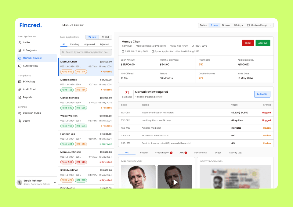
Loan Review Dashboard - designing the compliance workspace for consumer lending platforms
A compliance review dashboard consolidating identity, credit, fraud, and AML signals into one structured workspace that is designed for loan officers at regulated fintech lending platforms.
UI / UX Design
FINRA Regulated Pre-IPO Exchange Platform - 30% Faster Trade Execution, 3x Higher Closure Rate
Rebuilding the UX architecture and trade flow system for a pre-IPO share exchange platform, from a broken, document-heavy process to a structured, automated sequence that closes more deals, faster.
Year :
2024-2025
Industry :
Fintech
Company
Compliance Innovation
Project Duration :
1 Year
OverView
Pre-IPO secondary markets let employees and early investors sell private company shares before a company goes public and let accredited investors buy in before an IPO valuation reset.
The platform supports many deal structures to execute pre-ipo investments. Each structure has a different step count, different legal instruments, different signing sequences, and a different experience for buyer and seller. This case study focuses on the Direct + Forward Contract flow the complex and highest-volume structure on the platform.
Here's how it works: Every transaction moves through a regulated sequence: identity verification, legal document signing, a company's 30-day Right of First Refusal window, FBO escrow payment, and formal share assignment. When a company blocks a direct transfer, the deal restructures automatically into a Forward Contract-a separate legal instrument with its own negotiation flow, signing sequence, and deferred settlement tied to a future exit event.
The platform was built to automate all of this but the original design handled none of it. It failed to gain user’s trust due to no visibility into where their trade stood, no clarity on what to do next, and no confidence that their money was safe. Trades were abandoned mid-flow. Deals were lost.
30% Faster trade execution
60 days average → 42 days
3× Higher trade closure rate
15 in 100 trades → 45 in 100
$450K Additional deal value unlocked
Per every 100 trades on the platform
35% reduction
in support tickets
My Role
Led the design from first principles to final handoff. Prototyping, user testing, developer collaboration and design system documentation.
Problem and Solution
User Problem - (High-Stakes Investing Felt Like Navigating Blindfolded)
Pre-IPO equity is highly sought after among accredited investors, but access remains difficult. While platforms like Forge Global and EquityZen have made private-market investing more accessible, parts of the process still rely on email, paperwork, and intermediary coordination, and the level of visibility into deal progress varies by platform. There is no real-time dashboard to track where a trade stands.
What they need is not just a faster process. They need a customised dashboard that puts them in control, one that tells them exactly where their trade stands, what requires their attention, and what comes next at every step. A system that makes a complex, multi-week legal process feel transparent, predictable, and safe.
Current Product Problems
Client's platform attempted to solve this with a customized order dashboard, giving users visibility into each step to build a sense of control. The intent was right. The execution failed. A UX audit, combined with user interviews, internal analytics and tracking tools told a different story. The data pointed to two categories of failure.
Low Trade Closure Rate
Only 15 in every 100 trades were closing.
Long Trade Execution Time
Support tickets were high and clustered around the same steps repeatedly. Execution was averaging 60 days.
Business Problem
Bad UX in fintech is a revenue problem, not a design problem. With a 2.5% fee per side on $25,000 minimum transactions, every abandoned trade is $1,250 in direct platform revenue gone. At a 15% closure rate across hundreds of monthly transactions, the loss wasn't marginal, it was structural.
The deeper cost was credibility. The old design made the platform handling institutional-sized stakes look like an unstable MVP. First-time users comparing it to Forge Global or EquityZen made that judgment in 30 seconds. A platform cannot charge institutional fees while looking like a prototype. The redesign had one mandate: close more trades, faster, by making every user feel confident enough to keep going.
Solution and Iterations
Category 1 : Low Trade Closure Rate
The platform attempted to solve this with a customized order dashboard, giving users visibility into each step to build a sense of control. The intent was right. The execution failed. A UX audit, combined with user interviews and drop-off analysis, revealed seven structural failures.
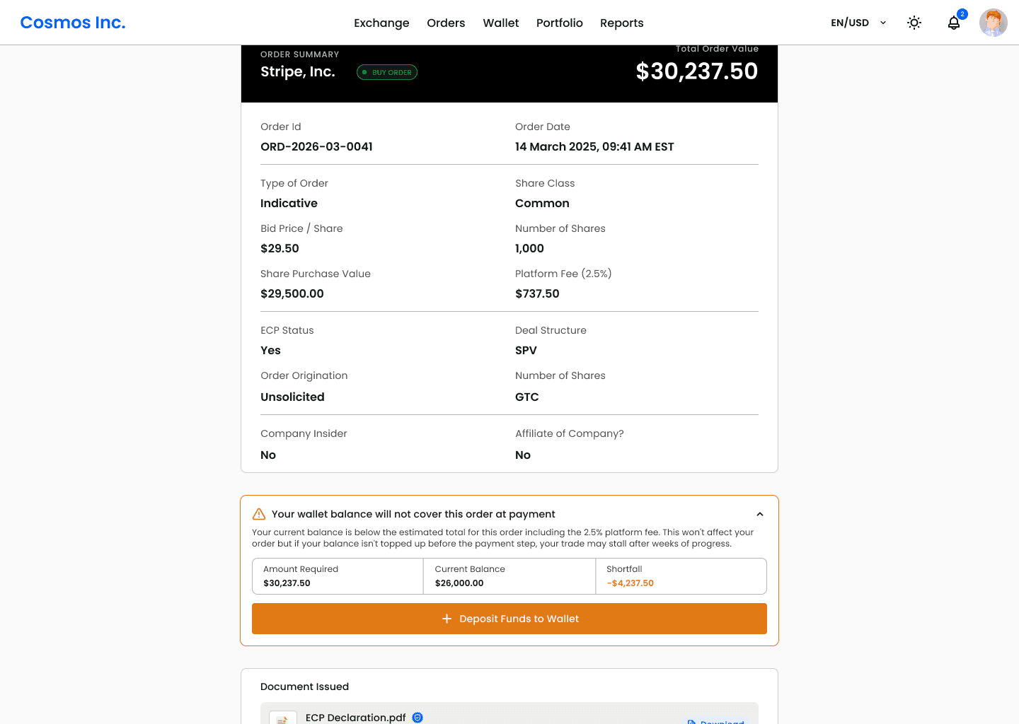
1) Order placement was a modal
The buy and sell order forms lived inside a 768px overlay modal. Modals are designed for confirmations and interruptions, not for initiating a legally binding financial commitment. Users told us that they hesitated before even filling the form, "it didn't feel serious enough." The primary CTA said "Continue" with no indication of how many steps followed.
Before
After
Before
After
Before
After
What we changed:
Order placement became a dedicated multi-step page with a clear step indicator showing exactly where the user was across all steps. No close button. No escape. Spatial permanence that matched the weight of the action.
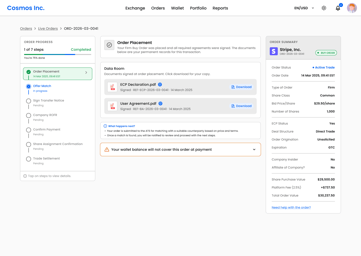
2) The tracker was the workspace
The progress stepper was the entire screen. A single non-collapsible column where navigation, status, and primary actions all lived inside the same component with no structural separation.
The information architecture was fundamentally broken. Every step, completed, active, pending were rendered at full height, forcing users to scroll through resolved history just to locate their current action. There was no spatial hierarchy between what was done and what needed a decision. Users couldn't scan the screen. They couldn't orient themselves. And they couldn't confidently act because nothing on the screen told them what mattered right now.
Before
After
Before
After
Before
After
What we changed:
We introduced a strict 3-column layout with non-overlapping ownership:
Left column: Tracker only. Progress navigation, step states, timestamps. Never contains a button, an input, or a document. Its only job is to show where the user is in the flow.
Middle column: Workspace. Every actionable moment like document signing, price negotiation, payment confirmation gets a dedicated full-width screen with its own hierarchy and context.
Right column: Dynamic order summary. The original order details, always visible, updates as trade progress. A financial anchor throughout the entire transaction.
3) Steps carried only system information
The stepper reflected system status, not user confidence. It showed operational updates but offered no clarity on what the current step actually meant, or what would happen next. The Offer Match step was a clear example, in the old design it was a single line with a label and a timestamp. No way to know if the platform was actively working or if something had stalled. Users with live orders had no reason to stay engaged and many didn't.
What we changed:
Every step across the entire flow suffered from the same problem - steps only told users what the system had done, never what it meant or what came next, with no context. The Offer Match screen is a clear example of how we addressed this:
An animated searching icon communicating active platform activity like something is happening, not stuck.
Contextual time expectation: "Matching typically takes 1–7 days depending on available sellers at your bid price", calibrating the user before anxiety sets in.
A link to view other active listings at similar price points, giving users something useful to do while they wait.
A "What happens next" section on every step screen explaining exactly what the platform is doing, what the counterparty is doing, and what the user will be asked to do when their turn comes.
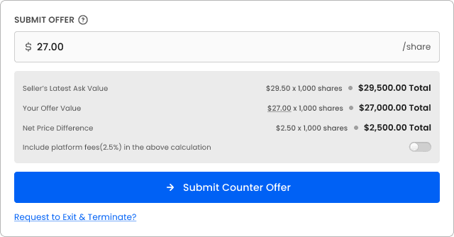
4) The negotiation screens were structurally broken
Accept and Reject were two equally sized adjacent buttons inside a 356px tracker column with no confirmation layer. A user could accept or reject a multi-thousand dollar counter-offer with a single tap, with no summary of what they were agreeing to? The offer history was not visible. The net proceeds impact of different price points was never shown. Users were making irreversible financial decisions with less friction than deleting a photo.
What we changed:
Negotiation became a dedicated full-width screen built around informed decision-making:
Full offer history timeline: every bid and counter shown in sequence with timestamps, so both parties have complete context before acting
Live net proceeds preview: As either party adjusts their offer, the net proceeds update in real time. "At $29.50: your net proceeds = $29,250.00", the financial consequence of every price point is visible before commitment.
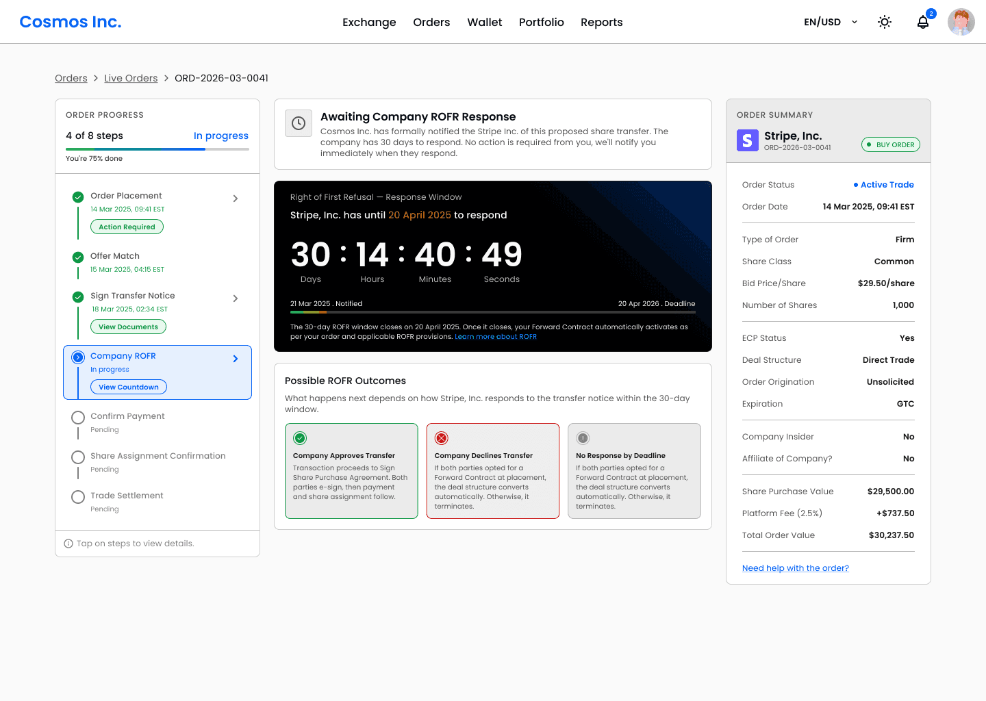
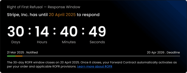
5) The ROFR waiting window generated the most support tickets
The 30-day company ROFR period, where a company reviews and approves or declines the share transfer was the single highest-traffic source of support requests. The old design showed "Wait for company ROFR" with no explanation of what the window was, how long it would last, what the possible outcomes were, or what would happen next. Users in a 30-day waiting window with no context assumed the worst. They emailed support.
What we changed:
The ROFR step became one of the most information-rich screens in the flow:
Three distinct outcome states designed: Approved, Declined, and No Response (30-day), each with its own screen, explanation, and "What happens next" section.
Plain language explanation of ROFR: what it is, why it exists, and what the company is legally allowed to do, written for a first-time user, not a lawyer.
Time calibration copy: "Most companies respond within 7–14 days", so users know what a normal wait looks like before they start worrying.
6) Copywriting was transactional, not guiding
Every step label was a status tag. For example at the payment step, the old design showed "Order payment from buyer" with a status of Complete and nothing else. No breakdown of what was paid or what the platform had done with the funds or what came next. A transaction worth $30,000 closed with less ceremony than a read receipt.
In a process most users are navigating for the first time, copy is the only guide they have. It read like a backend log, not what the user needed to understand. And this wasn't isolated to one step, every screen across the flow had the same problem.
What we changed:
Every step was rewritten around one rule: each screen must tell the user what is happening now, what their job is, what the counterparty is doing, and what comes next. Applied across the entire flow, for example on the payment and settlement screens:
Full fee and proceeds breakdown before and after payment confirmation.
When payment is confirmed, the buyer receives explicit confirmation that their funds have moved into a regulated FBO escrow account held at the platform's partner bank along with other details.
A settlement screen showing every action the platform took: fee deducted, proceeds released, documents issued, trade recorded.
Category 2 : Long Trade Execution Time
1) Removing Due Diligence in Flow - A Foundational Decision
The Problem:
Step 3 was Due Diligence, a manual step placing the entire responsibility of verifying share ownership on the buyer. After a match, buyers had to manually request identity documents and share certificates from an anonymous seller, wait for responses with no timeline, and independently cross-reference ownership records against cap table data they had no access to.
For a first-time participant in a private secondary market, this was not a due diligence step. It was an investigation. The timeline spoke for itself:
2 to 4 days for document collection, depending on how quickly each side responded
7 to 10 days for the buyer to independently verify ownership
A single step consuming 9 to 14 days of every trade
What We Explored First And Why We Rejected It:
Before making the decision to remove Due Diligence from the flow entirely, we designed it. Both buyer and seller states, the document request flow, verification status screens, fully built.
But user interviews told us something the screens couldn't fix. Users weren't dropping off just because of the poorly designed Due Diligence screens. They were dropping off because buyers reaching this step had no idea what share verification actually required of them. They were expected to independently cross-reference share certificates against cap table records and company filings they had no direct access to.
The Decision and Solution:
We made the harder call. The screens were discarded. The step was removed. Removing this step was not a design decision alone. It required buy-in from top management because it meant fundamentally changing how trades were processed on the platform. The platform had always placed verification responsibility on the buyer. Shifting it to the platform meant owning the process, building the infrastructure to support it, and taking on the operational cost of verifying every seller before they go live. It was a tough call. But the data made it impossible to ignore, the highest drop-off step in the flow, consuming up to 14 days per trade, was a direct result of this model. The decision was made.
Rather than making changes inside the existing order flow, we moved verification entirely to the order placement stage. At order placement, the seller is asked to do two things:
Upload their share ownership documents once
Tick a consent checkbox to share their KYC details already held by the platform from onboarding - no resubmission, no forms
The order does not go live until the platform completes verification. We built an internal verification system designed to be reused consistently across every transaction. Once verified, the order goes live and is actively matched. Every buyer on the platform now matches exclusively against pre-verified sellers.
The Impact :
Reduced verification time from 9 to 14 days down to 3 to 5 business days
Eliminated the single highest drop-off step in the entire flow
Buyers match against verified inventory only
Simplified the seller experience to one upload and one checkbox at order placement
Freed both parties from a manual back-and-forth that had no place in an automated transaction platform
2) ROFR and Negotiation - The Case Against Parallel Processing
The Problem:
In the Direct + Forward Contract flow, when a company declines a direct share transfer, the deal automatically converts to a Forward Contract, a separate legal agreement where the buyer still acquires the shares, but receives them at a future exit event such as an IPO or acquisition rather than immediately. Before this conversion can be finalised, both parties need to agree on the Forward Contract price through a negotiation window.
When we mapped the full transaction timeline, the price negotiation window stood out immediately. The price negotiation window had no deadline. It stayed open until both parties agreed or stopped responding entirely. Analytics showed this averaging 7 days per trade, with no upper limit. We could eliminate/reduce time on this step.
What We Explored First And Why We Rejected It:
The company's review period lasts up to 30 days. Since the company's right applies only to the direct transfer and not to the Forward Contract price, there was a theoretical opportunity to open negotiation in parallel while the review was still running.
If both parties pre-agreed a Forward Contract price during the wait, the deal could activate the moment the review closed, potentially saving the entire negotiation window. We explored this seriously. Then rejected it for two reasons.
UX cost: Running two concurrent processes breaks the foundational principle, users cannot hold two simultaneous mental states. More importantly, a user negotiating a price for a deal that might never happen is not motivated to negotiate seriously. Offer quality drops, rounds increase, and user confidence drops.
Engineering cost: The company's review and the Forward Contract negotiation are two legally distinct processes running on the same transaction record. If the company approves the transfer mid-negotiation, every negotiation state has to be discarded instantly and cleanly. The conflict resolution logic is complex, the edge cases multiply, and the engineering debt is significant all for a time saving that is not guaranteed.
The Solution:
Instead of opening negotiation earlier, we made the existing window work harder. We introduced a 5-day countdown timer on the negotiation window, replacing an open-ended process with a defined, visible deadline. Certainty replaced ambiguity. Both parties now know exactly how long they have, which changes the psychology of negotiation entirely. Offers become more serious. Rounds decrease. Decisions get made.
The Impact:
Replaced an undefined negotiation window with a fixed 5-day deadline, introducing urgency where none previously existed.
Reduced average negotiation duration from an open-ended 7-plus days to a structured 5-day window.
3) Payment failure surfaced too late in the flow
The Problem:
Buyers were making it through all stages, only to stall at payment because their wallet balance was insufficient. By that point both parties had invested 30+ days of effort. A funding gap that could have been flagged on day one was only visible on day thirty. Deals that were days from completion were collapsing entirely.
The Solution:
The fix required no changes to the transaction flow itself. At order placement, when the buyer enters their bid price and share quantity, the platform now runs a soft wallet sufficiency check against their current balance. Two outcomes:
Sufficient balance - order placement continues with no friction added
Insufficient balance - an amber inline warning appears: "Your current wallet balance will not cover this order at payment. Consider topping up before your trade reaches the payment step."
The warning is non-blocking. The buyer can still place the order. The decision to act on it is theirs. This was a deliberate choice, a hard block at order placement would turn away motivated buyers who intend to fund their wallet before payment arrives. A soft warning surfaces the gap 30 days earlier without reducing order volume.
Intentional Design Decisions
Small decisions, deliberate reasoning. Every detail on these screens was designed to reduce anxiety, build trust, and keep users moving, not just to look good.
1) First-time transaction onboarding overlay
On a user's first transaction, a one-time modal overlay shows a guided tour of the entire flow, step by step, with role tags, time estimates, and plain-language descriptions of what happens at each stage. Users who know the shape of the journey before it starts are far less anxious during it. The principle: reduce the fear of the unknown, not just the steps themselves.
2) Document trust signals
Every signed document now displays a tamper-evident timestamp - "Signed · DD/MM/YYYY, HH:MM EST” with a security badge, making signatures feel permanent and legally real rather than a checkbox on a PDF. A similar badge also appears for documents/user verified by the platform, "Verified by Cosmos Inc."
3) Negotiation history as a transparent timeline
The negotiation screen now shows the full offer history as a scrollable timestamped timeline, every bid and counter, in sequence, visible to both parties.
4) Live net proceeds preview during negotiation
As either party adjusts their offer, the column below offer input box updates in real time. "At $29.50: your net proceeds = $29,250.00." A toggle lets users include or exclude the platform fee from the displayed offer value, keeping the calculation transparent without making it cognitively overwhelming.
5) ROFR countdown reframed as a milestone, not a wait
The ROFR countdown is reframed from an anxious timer into a progress milestone. "The 30-day window closes DD/MM/YYYY. Once it closes, your Forward Contract automatically activates." The clock closing becomes a good event, the thing that unlocks the next step.
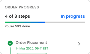
6) Explicit progress quantification at every step
The existing progress bar is made explicit, e.g "6 of 8 steps complete · 75% done". Behavioural economics identifies this as the endowment effect on progress: once a user has invested 50% of a journey, abandoning it registers as a loss, not a neutral exit.
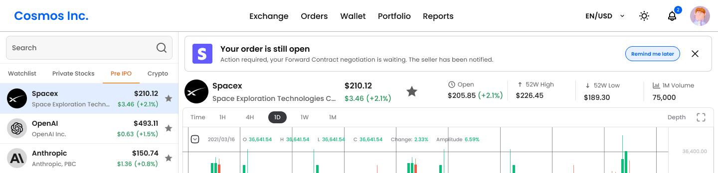
7) Toaster notifications with progress bar and action links
Every system notification now includes a 2px depleting progress bar Toaster notification, green for success, blue for informational, amber for pending. Critically, each toaster includes the next logical action as a clickable inline link.
8) Abandoned transaction recovery, persistent in-app prompt
If a required action goes untaken for 24 hours, a persistent in-app banner surfaces. The fintech equivalent of cart abandonment recovery.
Shipping to design system
Since this was a newly introduced pattern, I documented all states, variants, interactions, and edge cases in full and handed it off to the design system.
In summary, I closed more trades, faster, by
01.
01.
Removing days from execution time
Eliminated the highest drop-off step entirely by moving verification upstream, capped the negotiation window at 5 days, and surfaced wallet shortfalls at order placement, cutting average execution from 60 to 42 days.
02.
02.
Rebuilding the flow architecture
Replaced a modal-based tracker that buried actions inside navigation with a dedicated 3-column page, giving every critical decision its own space, hierarchy, and weight. Trades that stalled because users couldn't find their action or understand their commitment now had a clear path forward, directly lifting closure rate by 3x.
03.
03.
Designing for trust at every step
Elevated the platform from a lightweight MVP into an institutional-grade product. Added contextual guidance and intentional micro-decisions so users always knew where they stood, what to do next, and that their money was safe.
More Projects
UI / UX Design
Email Marketing Analytics -Turning Campaign Data into Capital-Raising Intelligence
Private token issuers were running email campaigns with no way to isolate whether underperformance was a content problem, an infrastructure problem, or an audience problem. This tool was built to answer that question precisely.
UI / UX Design
Loan Review Dashboard - designing the compliance workspace for consumer lending platforms
A compliance review dashboard consolidating identity, credit, fraud, and AML signals into one structured workspace that is designed for loan officers at regulated fintech lending platforms.
UI / UX Design
FINRA Regulated Pre-IPO Exchange Platform - 30% Faster Trade Execution, 3x Higher Closure Rate
Rebuilding the UX architecture and trade flow system for a pre-IPO share exchange platform, from a broken, document-heavy process to a structured, automated sequence that closes more deals, faster.
Year :
2024-2025
Industry :
Fintech
Company
Compliance Innovation
Project Duration :
1 Year
OverView
Pre-IPO secondary markets let employees and early investors sell private company shares before a company goes public and let accredited investors buy in before an IPO valuation reset.
The platform supports many deal structures to execute pre-ipo investments. Each structure has a different step count, different legal instruments, different signing sequences, and a different experience for buyer and seller. This case study focuses on the Direct + Forward Contract flow the complex and highest-volume structure on the platform.
Here's how it works: Every transaction moves through a regulated sequence: identity verification, legal document signing, a company's 30-day Right of First Refusal window, FBO escrow payment, and formal share assignment. When a company blocks a direct transfer, the deal restructures automatically into a Forward Contract-a separate legal instrument with its own negotiation flow, signing sequence, and deferred settlement tied to a future exit event.
The platform was built to automate all of this but the original design handled none of it. It failed to gain user’s trust due to no visibility into where their trade stood, no clarity on what to do next, and no confidence that their money was safe. Trades were abandoned mid-flow. Deals were lost.
30% Faster trade execution
60 days average → 42 days
3× Higher trade closure rate
15 in 100 trades → 45 in 100
$450K Additional deal value unlocked
Per every 100 trades on the platform
35% reduction
in support tickets
My Role
Led the design from first principles to final handoff. Prototyping, user testing, developer collaboration and design system documentation.
Problem and Solution
User Problem - (High-Stakes Investing Felt Like Navigating Blindfolded)
Pre-IPO equity is highly sought after among accredited investors, but access remains difficult. While platforms like Forge Global and EquityZen have made private-market investing more accessible, parts of the process still rely on email, paperwork, and intermediary coordination, and the level of visibility into deal progress varies by platform. There is no real-time dashboard to track where a trade stands.
What they need is not just a faster process. They need a customised dashboard that puts them in control, one that tells them exactly where their trade stands, what requires their attention, and what comes next at every step. A system that makes a complex, multi-week legal process feel transparent, predictable, and safe.
Current Product Problems
Client's platform attempted to solve this with a customized order dashboard, giving users visibility into each step to build a sense of control. The intent was right. The execution failed. A UX audit, combined with user interviews, internal analytics and tracking tools told a different story. The data pointed to two categories of failure.
Low Trade Closure Rate
Only 15 in every 100 trades were closing.
Long Trade Execution Time
Support tickets were high and clustered around the same steps repeatedly. Execution was averaging 60 days.
Business Problem
Bad UX in fintech is a revenue problem, not a design problem. With a 2.5% fee per side on $25,000 minimum transactions, every abandoned trade is $1,250 in direct platform revenue gone. At a 15% closure rate across hundreds of monthly transactions, the loss wasn't marginal, it was structural.
The deeper cost was credibility. The old design made the platform handling institutional-sized stakes look like an unstable MVP. First-time users comparing it to Forge Global or EquityZen made that judgment in 30 seconds. A platform cannot charge institutional fees while looking like a prototype. The redesign had one mandate: close more trades, faster, by making every user feel confident enough to keep going.
Solution and Iterations
Category 1 : Low Trade Closure Rate
The platform attempted to solve this with a customized order dashboard, giving users visibility into each step to build a sense of control. The intent was right. The execution failed. A UX audit, combined with user interviews and drop-off analysis, revealed seven structural failures.
1) Order placement was a modal
The buy and sell order forms lived inside a 768px overlay modal. Modals are designed for confirmations and interruptions, not for initiating a legally binding financial commitment. Users told us that they hesitated before even filling the form, "it didn't feel serious enough." The primary CTA said "Continue" with no indication of how many steps followed.
Before
After
Before
After
Before
After
What we changed:
Order placement became a dedicated multi-step page with a clear step indicator showing exactly where the user was across all steps. No close button. No escape. Spatial permanence that matched the weight of the action.
2) The tracker was the workspace
The progress stepper was the entire screen. A single non-collapsible column where navigation, status, and primary actions all lived inside the same component with no structural separation.
The information architecture was fundamentally broken. Every step, completed, active, pending were rendered at full height, forcing users to scroll through resolved history just to locate their current action. There was no spatial hierarchy between what was done and what needed a decision. Users couldn't scan the screen. They couldn't orient themselves. And they couldn't confidently act because nothing on the screen told them what mattered right now.
Before
After
Before
After
Before
After
What we changed:
We introduced a strict 3-column layout with non-overlapping ownership:
Left column: Tracker only. Progress navigation, step states, timestamps. Never contains a button, an input, or a document. Its only job is to show where the user is in the flow.
Middle column: Workspace. Every actionable moment like document signing, price negotiation, payment confirmation gets a dedicated full-width screen with its own hierarchy and context.
Right column: Dynamic order summary. The original order details, always visible, updates as trade progress. A financial anchor throughout the entire transaction.
3) Steps carried only system information
The stepper reflected system status, not user confidence. It showed operational updates but offered no clarity on what the current step actually meant, or what would happen next. The Offer Match step was a clear example, in the old design it was a single line with a label and a timestamp. No way to know if the platform was actively working or if something had stalled. Users with live orders had no reason to stay engaged and many didn't.
What we changed:
Every step across the entire flow suffered from the same problem - steps only told users what the system had done, never what it meant or what came next, with no context. The Offer Match screen is a clear example of how we addressed this:
An animated searching icon communicating active platform activity like something is happening, not stuck.
Contextual time expectation: "Matching typically takes 1–7 days depending on available sellers at your bid price", calibrating the user before anxiety sets in.
A link to view other active listings at similar price points, giving users something useful to do while they wait.
A "What happens next" section on every step screen explaining exactly what the platform is doing, what the counterparty is doing, and what the user will be asked to do when their turn comes.
4) The negotiation screens were structurally broken
Accept and Reject were two equally sized adjacent buttons inside a 356px tracker column with no confirmation layer. A user could accept or reject a multi-thousand dollar counter-offer with a single tap, with no summary of what they were agreeing to? The offer history was not visible. The net proceeds impact of different price points was never shown. Users were making irreversible financial decisions with less friction than deleting a photo.
What we changed:
Negotiation became a dedicated full-width screen built around informed decision-making:
Full offer history timeline: every bid and counter shown in sequence with timestamps, so both parties have complete context before acting
Live net proceeds preview: As either party adjusts their offer, the net proceeds update in real time. "At $29.50: your net proceeds = $29,250.00", the financial consequence of every price point is visible before commitment.
5) The ROFR waiting window generated the most support tickets
The 30-day company ROFR period, where a company reviews and approves or declines the share transfer was the single highest-traffic source of support requests. The old design showed "Wait for company ROFR" with no explanation of what the window was, how long it would last, what the possible outcomes were, or what would happen next. Users in a 30-day waiting window with no context assumed the worst. They emailed support.
What we changed:
The ROFR step became one of the most information-rich screens in the flow:
Three distinct outcome states designed: Approved, Declined, and No Response (30-day), each with its own screen, explanation, and "What happens next" section.
Plain language explanation of ROFR: what it is, why it exists, and what the company is legally allowed to do, written for a first-time user, not a lawyer.
Time calibration copy: "Most companies respond within 7–14 days", so users know what a normal wait looks like before they start worrying.
6) Copywriting was transactional, not guiding
Every step label was a status tag. For example at the payment step, the old design showed "Order payment from buyer" with a status of Complete and nothing else. No breakdown of what was paid or what the platform had done with the funds or what came next. A transaction worth $30,000 closed with less ceremony than a read receipt.
In a process most users are navigating for the first time, copy is the only guide they have. It read like a backend log, not what the user needed to understand. And this wasn't isolated to one step, every screen across the flow had the same problem.
What we changed:
Every step was rewritten around one rule: each screen must tell the user what is happening now, what their job is, what the counterparty is doing, and what comes next. Applied across the entire flow, for example on the payment and settlement screens:
Full fee and proceeds breakdown before and after payment confirmation.
When payment is confirmed, the buyer receives explicit confirmation that their funds have moved into a regulated FBO escrow account held at the platform's partner bank along with other details.
A settlement screen showing every action the platform took: fee deducted, proceeds released, documents issued, trade recorded.
Category 2 : Long Trade Execution Time
1) Removing Due Diligence in Flow - A Foundational Decision
The Problem:
Step 3 was Due Diligence, a manual step placing the entire responsibility of verifying share ownership on the buyer. After a match, buyers had to manually request identity documents and share certificates from an anonymous seller, wait for responses with no timeline, and independently cross-reference ownership records against cap table data they had no access to.
For a first-time participant in a private secondary market, this was not a due diligence step. It was an investigation. The timeline spoke for itself:
2 to 4 days for document collection, depending on how quickly each side responded
7 to 10 days for the buyer to independently verify ownership
A single step consuming 9 to 14 days of every trade
What We Explored First And Why We Rejected It:
Before making the decision to remove Due Diligence from the flow entirely, we designed it. Both buyer and seller states, the document request flow, verification status screens, fully built.
But user interviews told us something the screens couldn't fix. Users weren't dropping off just because of the poorly designed Due Diligence screens. They were dropping off because buyers reaching this step had no idea what share verification actually required of them. They were expected to independently cross-reference share certificates against cap table records and company filings they had no direct access to.
The Decision and Solution:
We made the harder call. The screens were discarded. The step was removed. Removing this step was not a design decision alone. It required buy-in from top management because it meant fundamentally changing how trades were processed on the platform. The platform had always placed verification responsibility on the buyer. Shifting it to the platform meant owning the process, building the infrastructure to support it, and taking on the operational cost of verifying every seller before they go live. It was a tough call. But the data made it impossible to ignore, the highest drop-off step in the flow, consuming up to 14 days per trade, was a direct result of this model. The decision was made.
Rather than making changes inside the existing order flow, we moved verification entirely to the order placement stage. At order placement, the seller is asked to do two things:
Upload their share ownership documents once
Tick a consent checkbox to share their KYC details already held by the platform from onboarding - no resubmission, no forms
The order does not go live until the platform completes verification. We built an internal verification system designed to be reused consistently across every transaction. Once verified, the order goes live and is actively matched. Every buyer on the platform now matches exclusively against pre-verified sellers.
The Impact :
Reduced verification time from 9 to 14 days down to 3 to 5 business days
Eliminated the single highest drop-off step in the entire flow
Buyers match against verified inventory only
Simplified the seller experience to one upload and one checkbox at order placement
Freed both parties from a manual back-and-forth that had no place in an automated transaction platform
2) ROFR and Negotiation - The Case Against Parallel Processing
The Problem:
In the Direct + Forward Contract flow, when a company declines a direct share transfer, the deal automatically converts to a Forward Contract, a separate legal agreement where the buyer still acquires the shares, but receives them at a future exit event such as an IPO or acquisition rather than immediately. Before this conversion can be finalised, both parties need to agree on the Forward Contract price through a negotiation window.
When we mapped the full transaction timeline, the price negotiation window stood out immediately. The price negotiation window had no deadline. It stayed open until both parties agreed or stopped responding entirely. Analytics showed this averaging 7 days per trade, with no upper limit. We could eliminate/reduce time on this step.
What We Explored First And Why We Rejected It:
The company's review period lasts up to 30 days. Since the company's right applies only to the direct transfer and not to the Forward Contract price, there was a theoretical opportunity to open negotiation in parallel while the review was still running.
If both parties pre-agreed a Forward Contract price during the wait, the deal could activate the moment the review closed, potentially saving the entire negotiation window. We explored this seriously. Then rejected it for two reasons.
UX cost: Running two concurrent processes breaks the foundational principle, users cannot hold two simultaneous mental states. More importantly, a user negotiating a price for a deal that might never happen is not motivated to negotiate seriously. Offer quality drops, rounds increase, and user confidence drops.
Engineering cost: The company's review and the Forward Contract negotiation are two legally distinct processes running on the same transaction record. If the company approves the transfer mid-negotiation, every negotiation state has to be discarded instantly and cleanly. The conflict resolution logic is complex, the edge cases multiply, and the engineering debt is significant all for a time saving that is not guaranteed.
The Solution:
Instead of opening negotiation earlier, we made the existing window work harder. We introduced a 5-day countdown timer on the negotiation window, replacing an open-ended process with a defined, visible deadline. Certainty replaced ambiguity. Both parties now know exactly how long they have, which changes the psychology of negotiation entirely. Offers become more serious. Rounds decrease. Decisions get made.
The Impact:
Replaced an undefined negotiation window with a fixed 5-day deadline, introducing urgency where none previously existed.
Reduced average negotiation duration from an open-ended 7-plus days to a structured 5-day window.
3) Payment failure surfaced too late in the flow
The Problem:
Buyers were making it through all stages, only to stall at payment because their wallet balance was insufficient. By that point both parties had invested 30+ days of effort. A funding gap that could have been flagged on day one was only visible on day thirty. Deals that were days from completion were collapsing entirely.
The Solution:
The fix required no changes to the transaction flow itself. At order placement, when the buyer enters their bid price and share quantity, the platform now runs a soft wallet sufficiency check against their current balance. Two outcomes:
Sufficient balance - order placement continues with no friction added
Insufficient balance - an amber inline warning appears: "Your current wallet balance will not cover this order at payment. Consider topping up before your trade reaches the payment step."
The warning is non-blocking. The buyer can still place the order. The decision to act on it is theirs. This was a deliberate choice, a hard block at order placement would turn away motivated buyers who intend to fund their wallet before payment arrives. A soft warning surfaces the gap 30 days earlier without reducing order volume.
Intentional Design Decisions
Small decisions, deliberate reasoning. Every detail on these screens was designed to reduce anxiety, build trust, and keep users moving, not just to look good.
1) First-time transaction onboarding overlay
On a user's first transaction, a one-time modal overlay shows a guided tour of the entire flow, step by step, with role tags, time estimates, and plain-language descriptions of what happens at each stage. Users who know the shape of the journey before it starts are far less anxious during it. The principle: reduce the fear of the unknown, not just the steps themselves.
2) Document trust signals
Every signed document now displays a tamper-evident timestamp - "Signed · DD/MM/YYYY, HH:MM EST” with a security badge, making signatures feel permanent and legally real rather than a checkbox on a PDF. A similar badge also appears for documents/user verified by the platform, "Verified by Cosmos Inc."
3) Negotiation history as a transparent timeline
The negotiation screen now shows the full offer history as a scrollable timestamped timeline, every bid and counter, in sequence, visible to both parties.
4) Live net proceeds preview during negotiation
As either party adjusts their offer, the column below offer input box updates in real time. "At $29.50: your net proceeds = $29,250.00." A toggle lets users include or exclude the platform fee from the displayed offer value, keeping the calculation transparent without making it cognitively overwhelming.
5) ROFR countdown reframed as a milestone, not a wait
The ROFR countdown is reframed from an anxious timer into a progress milestone. "The 30-day window closes DD/MM/YYYY. Once it closes, your Forward Contract automatically activates." The clock closing becomes a good event, the thing that unlocks the next step.
6) Explicit progress quantification at every step
The existing progress bar is made explicit, e.g "6 of 8 steps complete · 75% done". Behavioural economics identifies this as the endowment effect on progress: once a user has invested 50% of a journey, abandoning it registers as a loss, not a neutral exit.
7) Toaster notifications with progress bar and action links
Every system notification now includes a 2px depleting progress bar Toaster notification, green for success, blue for informational, amber for pending. Critically, each toaster includes the next logical action as a clickable inline link.
8) Abandoned transaction recovery, persistent in-app prompt
If a required action goes untaken for 24 hours, a persistent in-app banner surfaces. The fintech equivalent of cart abandonment recovery.
Shipping to design system
Since this was a newly introduced pattern, I documented all states, variants, interactions, and edge cases in full and handed it off to the design system.
In summary, I closed more trades, faster, by
01.
01.
Removing days from execution time
Eliminated the highest drop-off step entirely by moving verification upstream, capped the negotiation window at 5 days, and surfaced wallet shortfalls at order placement, cutting average execution from 60 to 42 days.
02.
02.
Rebuilding the flow architecture
Replaced a modal-based tracker that buried actions inside navigation with a dedicated 3-column page, giving every critical decision its own space, hierarchy, and weight. Trades that stalled because users couldn't find their action or understand their commitment now had a clear path forward, directly lifting closure rate by 3x.
03.
03.
Designing for trust at every step
Elevated the platform from a lightweight MVP into an institutional-grade product. Added contextual guidance and intentional micro-decisions so users always knew where they stood, what to do next, and that their money was safe.
More Projects
UI / UX Design
Email Marketing Analytics -Turning Campaign Data into Capital-Raising Intelligence
Private token issuers were running email campaigns with no way to isolate whether underperformance was a content problem, an infrastructure problem, or an audience problem. This tool was built to answer that question precisely.
UI / UX Design
Loan Review Dashboard - designing the compliance workspace for consumer lending platforms
A compliance review dashboard consolidating identity, credit, fraud, and AML signals into one structured workspace that is designed for loan officers at regulated fintech lending platforms.